Thesis - Showdown
###This is truly it. No more meandering around, pivoting, shuffling. No cold feet. This is the final showdown.
![]()
My process thus far has led me to a prototype I call EQL. It’s a consumer facing product in which we can offset our purchases into carbon reducing investments.
###Wireframes
After thinking through the flow from a users perspective here. Last week I went back to the whiteboard to figure out how the screens might take shape.
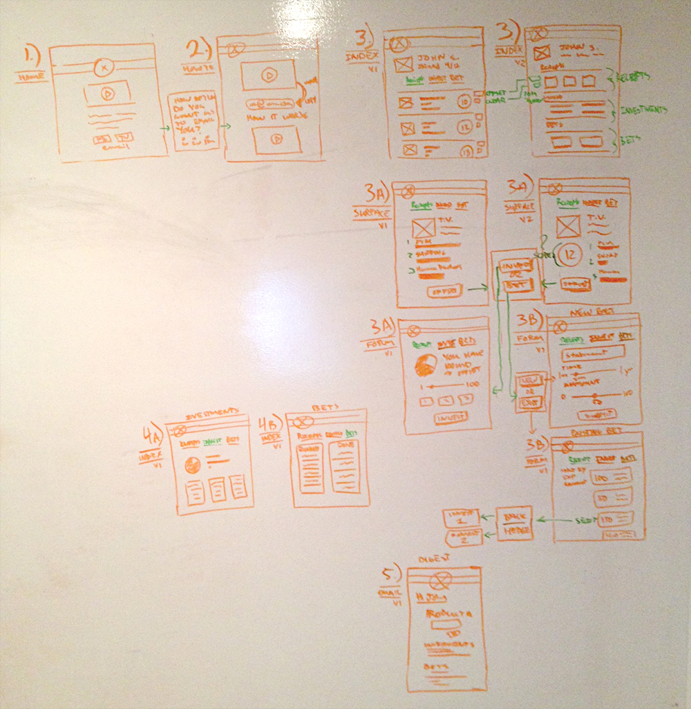
Once I had a basic structure of screens I used a green marker to define the elements of the page that would be dynamic and/or ask the user to make a decision.
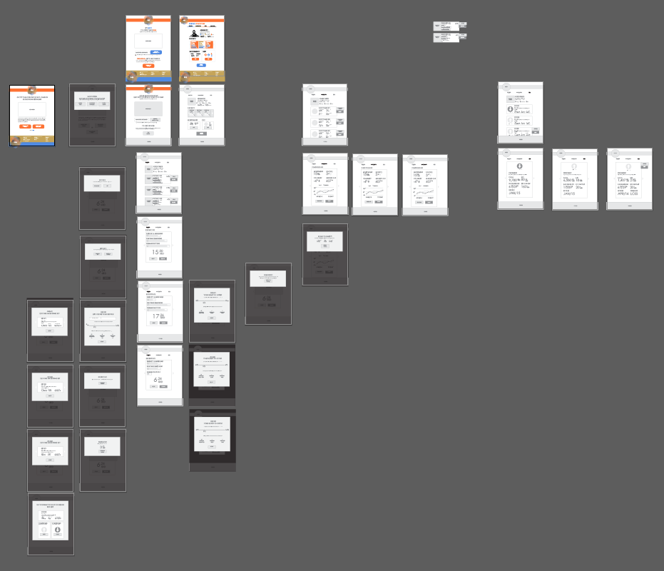
Lastly, I created black and white wireframes in Illustrator. Here they are all together.
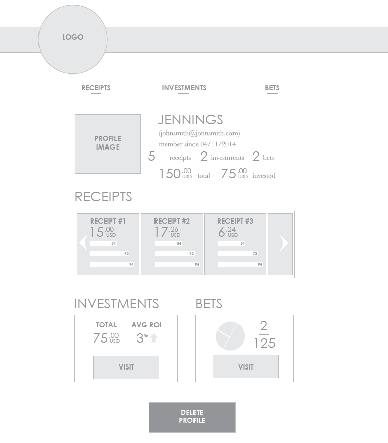
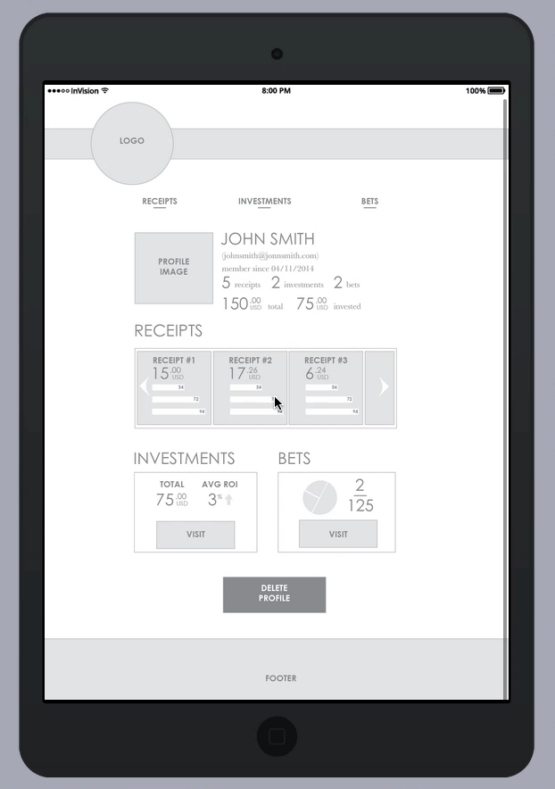
And here’s a detailed view of the basic profile page.
###Design
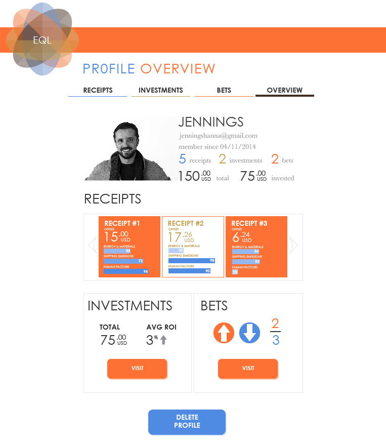
Here is the profile page designed.
###Color:
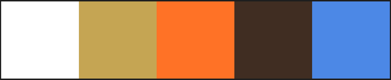
I am using the sun surf theme from Adobe Kuler (https://kuler.adobe.com/Sun-Surf-color-theme-181906/). I really love the gold, orange, and blue combo. I am also a huge fan of slightly off-whites. The brown is steady and helps ground the gold, blue, and orange. For example, when I need a dark setting color for info buttons or to change up the text color for clarification. The orange and blue provide a perfect contrast to one another and are inviting. They’ll be used primarily as button text and to highlight importance in headlines. The gold is kept minimal but is used as the primary color for when things are of intrinsic value, like funds or winnings. That said, it’s also the primary color for the Investments section. In the navigation the four colors are used as global navigation indicators between the receipts, investments, and bets profile indexes.
###Type:
The headline and UI font is Century Gothic. I am a fan of gothic families in general but for this project I wanted a gothic that is a little bolder without being Obama Gotham Ultra-Bold ‘HOPE’. Century Gothic was chosen because it has a nice variety in weights but doesn’t compromise much between them. For example the hero text line fits nicely and is readably clean. Whereas the buttons use a condensed bold to offset from the headlines and body text. They work seamlessly, and to most it might not even be clear they are in the same family. Century Gothic is a modern font with the breathe that I needed to keep this fun and quirky, but also contemporary. The numbers set well to — which was a large factor in the decision making process.
The body font I chose is Baskerville. One of my favorite quirky fonts. I used it for my wedding collateral so I am familiar with it’s funky-freshness. It’s almost like there is no bottom or top. The letters sort of jump up and down, but they never fall on top of each other. I think it’s a super readable font. It also keeps things positive, as not instilling climate guilt with the product is a huge goal for me, this font helps accomplish that simply. It’s also a serif with beautiful curves, a lot like Georgia, which some designers argue is the most readable font ever.
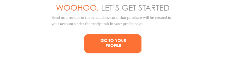
###Click-Through Prototype:
Here it is animated:
Here is link to the click-through Invision App (http://invis.io/HCRVQ787) feel free to play around.
Click throughs always help and are a quick way to see something in motion (or interactions). I’ve also used this to put the app in front of my advisor, my teachers, and some peers. Having someone follow the process gives them the ability to give clear and condensed feedback. Which is very helpful at this time for a couple of reasons: One it keeps me from taking large conceptual steps backwards and two it provides insights into the details, not the approach, that feedback can be utilized and inform the product not the strategy.
###Code:
Now that the design and prototype are coming together it’s time to think about coding. I am a front-end developer which means I have limitations to my knowledge of how to use data and dynamic scripting techniques, but I can do all the styling and some simple PHP to update numbers.
At this moment I have only bought the domain (www.EQLs.me), and set it up with my new favorite host (https://www.nearlyfreespeech.net/). The next step is to start coding. That will be the next 3 weeks…
###Video:
The video plan is outlined here. At this point it requires that I have a coded prototype. I could design all the wires and simply use a click-through like above but I don’t think that is all that valuable. I’d rather have the coded prototype than the user journey video anyways. Sometimes you have to compromise and I still have a PROCESS BOOK to worry about before May 5th.